

Home chromotherapy: the palette for your furnishings
In the design of domestic environments, the effect of colors on mood is often underestimated. Chromotherapy demonstrates the tangible influence of color on the atmosphere and mood of the inhabitants, guiding thoughtful choices to create harmonious and welcoming spaces.
Determining the colors for a domestic environment
Determining the desired atmosphere in a room is crucial. Warm tones evoke comfort and emotions, while cool tones suggest tranquility, balancing subjective emotions with functionality. The practical implementation involves the careful selection of materials and coordinated details for a harmonious visual consistency.
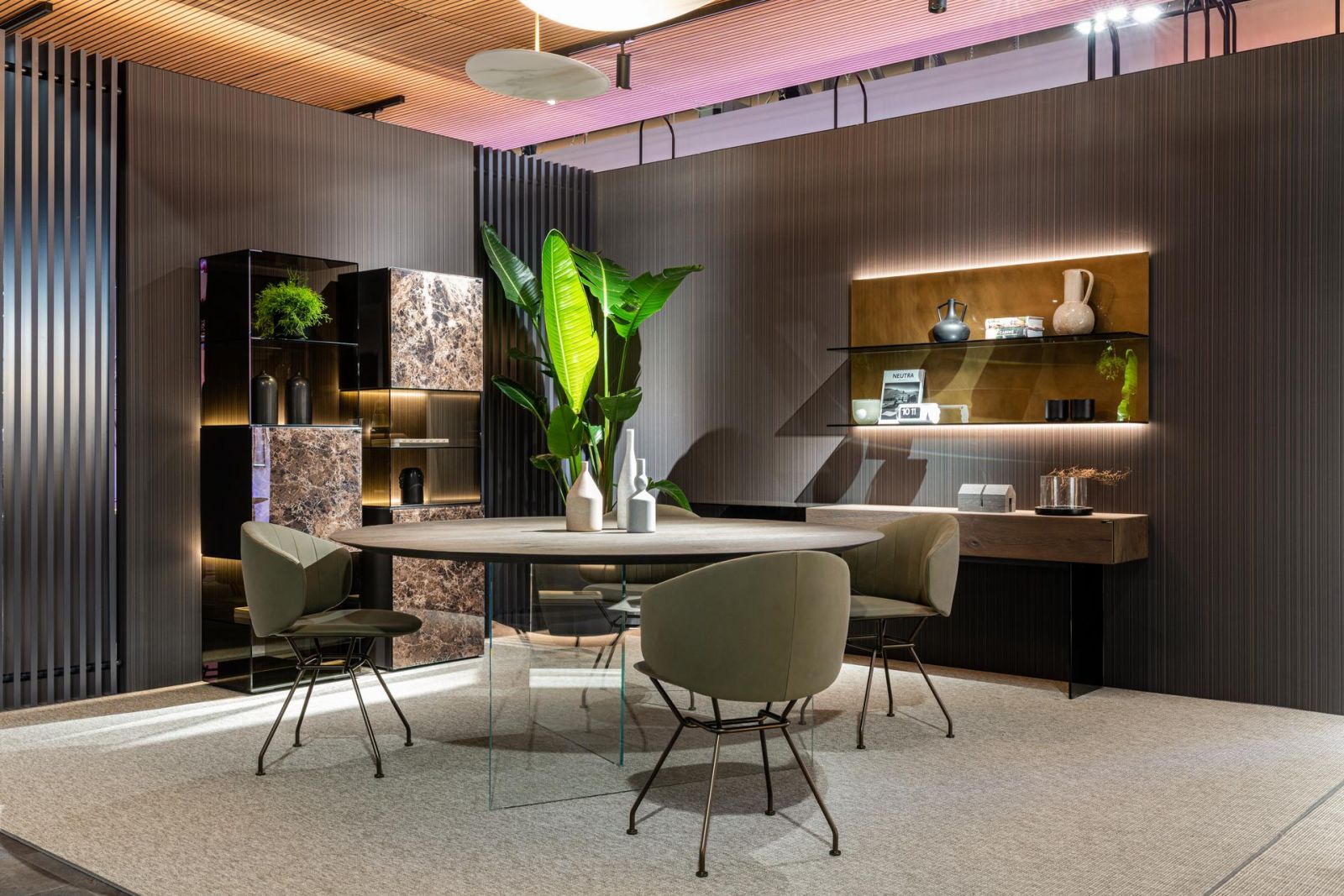
Air - Lago
Enlarge photo
The moodboard, a sophisticated visual composition, anticipates the style and concept of a space, essential in interior design. Based on careful listening to the client, it defines a dominant style that permeates the environment, using color, light, and materials to anticipate the emotional experience in every room.
Which color palette to choose for your home
Color therapy, through a conscious color palette, transforms the home into a balanced and harmonious environment, positively influencing mood and overall well-being of body and mind.
The choice of neutral colors such as white or soft shades provides an elegant and relaxing base, but it is not mandatory.
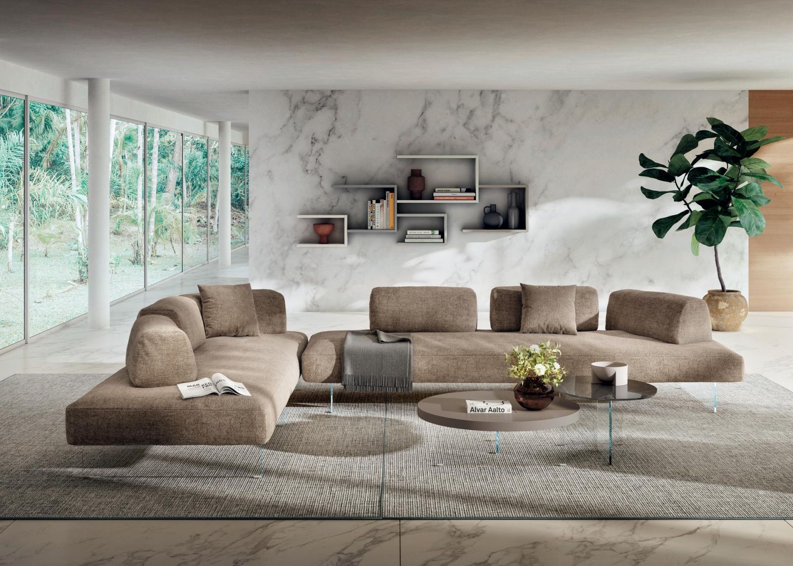
Lago
Enlarge photo
Air - Lago
Enlarge photo
We recommend balancing with nude tones to add elegance and spaciousness. White infuses peace and brightness, while brown stimulates the appetite, ideal for the kitchen and dining room.
Black, with its intense shades, promotes concentration and reflective thinking. Used sparingly, preferably matte, it adds elegance and mystery to environments, creating sophisticated contrasts.
Cool colors
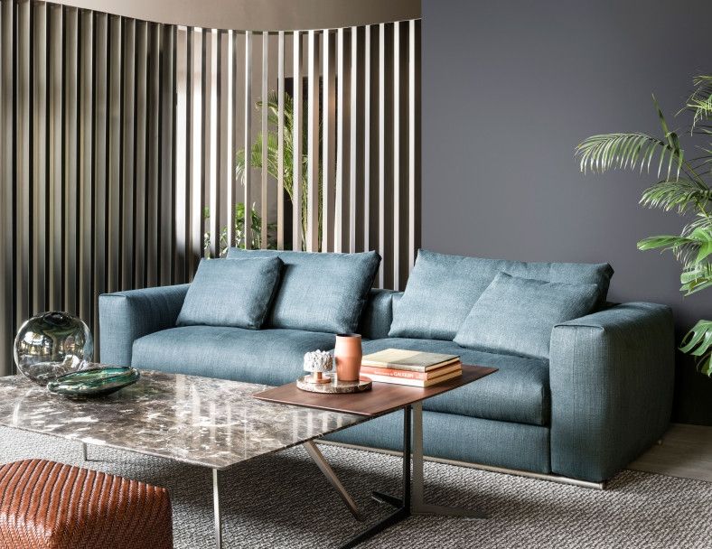
Cool colors, such as blue and green, bring elegance, peace, and harmony to home environments. Blue, with variations in shade, induces tranquility and can lower blood pressure; lighter shades avoid dark atmospheres. Green, relaxing and natural, creates a harmonious and peaceful context, suitable for various rooms.
Warm colors
Warm colors, if used with discernment, offer energizing sensations without being excessively eccentric. Purple stimulates creativity, while pink creates a relaxing atmosphere, ideal for the kitchen and bedroom.
Foscarini
Enlarge photo
Red and orange, vibrant and dynamic, are perfect for the living room and kitchen, promoting enthusiasm. Yellow, fresh and energizing, is great for the kitchen and study, facilitating communication and creating bright and positive environments.
The choice of colors in the home goes beyond aesthetics, subtly influencing emotions and daily well-being. Color therapy allows you to personalize environments, reflecting style and emotional needs.
Format Progetti Abitativi transforms spaces into emotional refuges, offering a unique journey of self-discovery.
